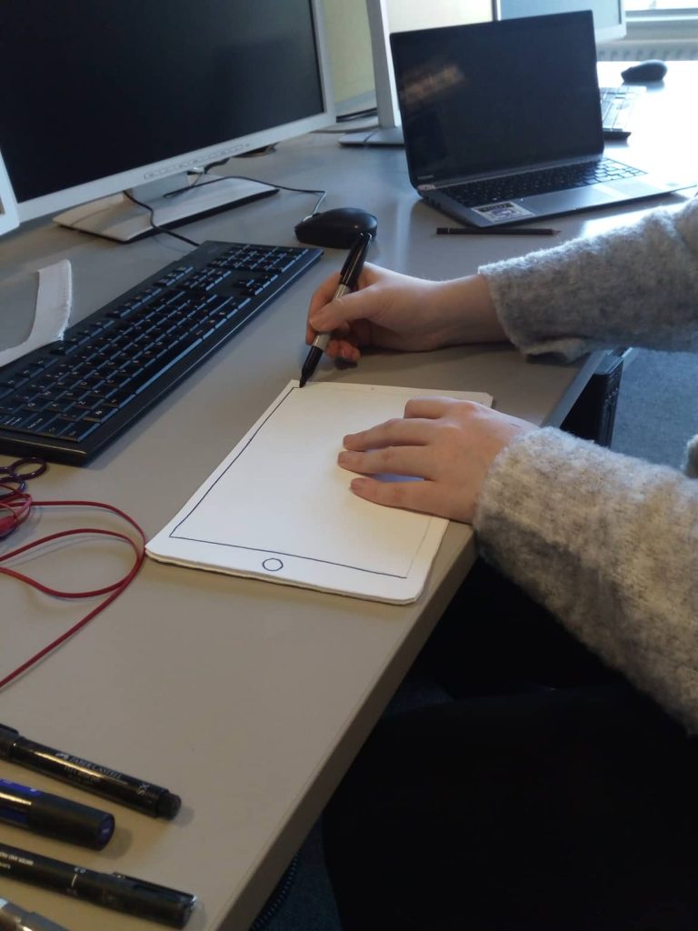
Paper prototype
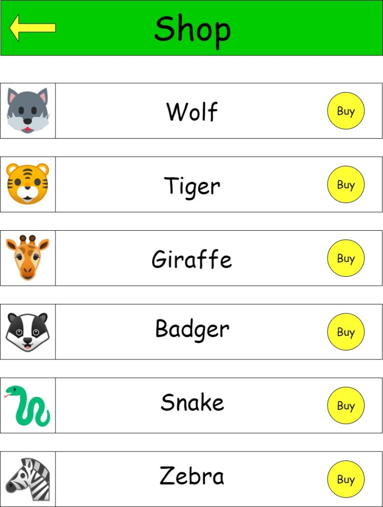
When it came to designing the paper prototypes Tara and I took on different sections to design. I designed the main menu,activities menu,quiz menu and quiz screen. While Tara designed the shop and my animals screens. I also designed some animals to go with the animal theme of the app.
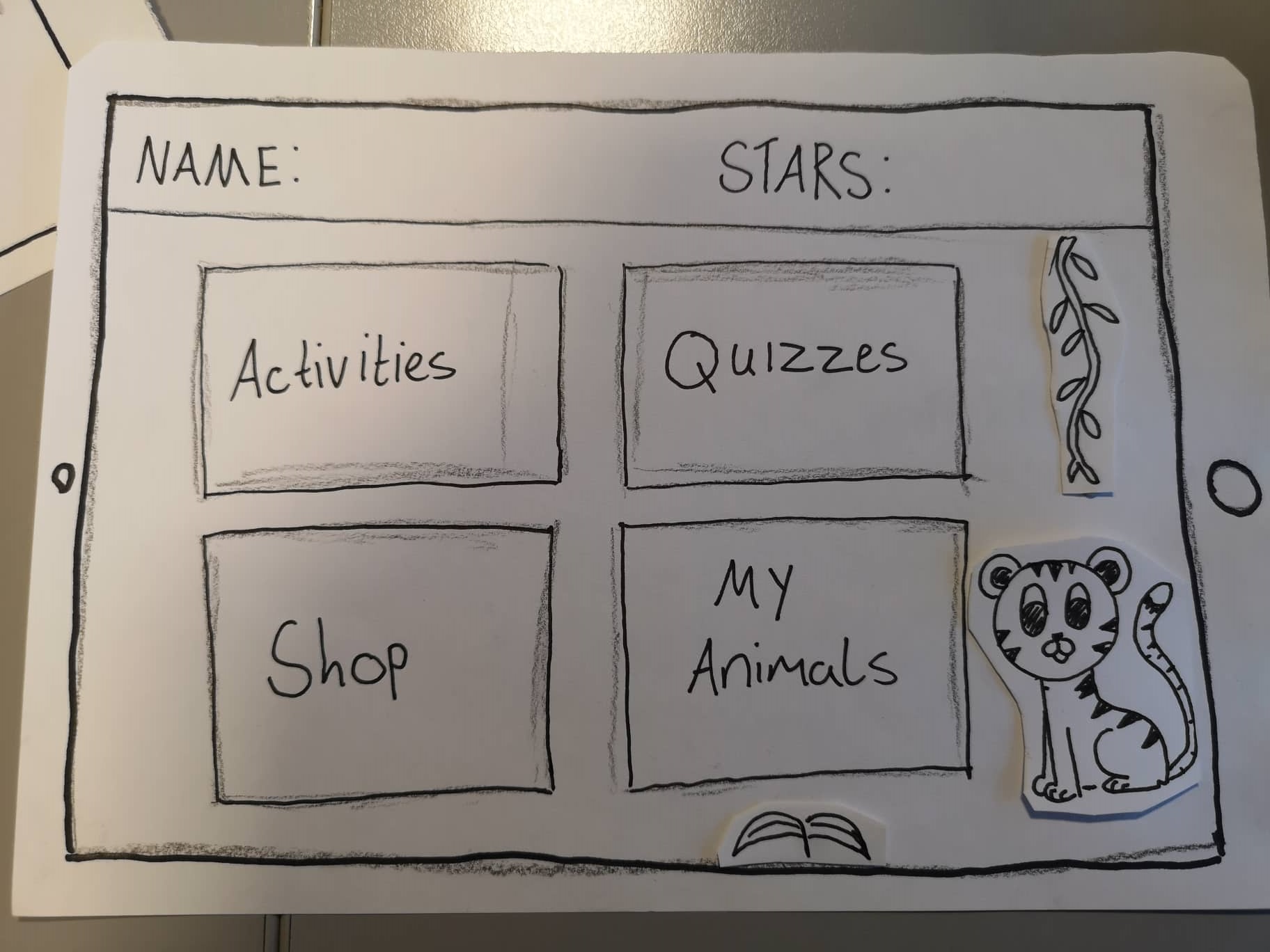
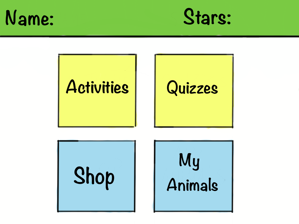
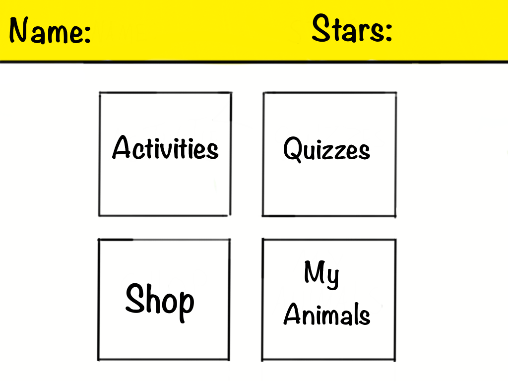
Main menu 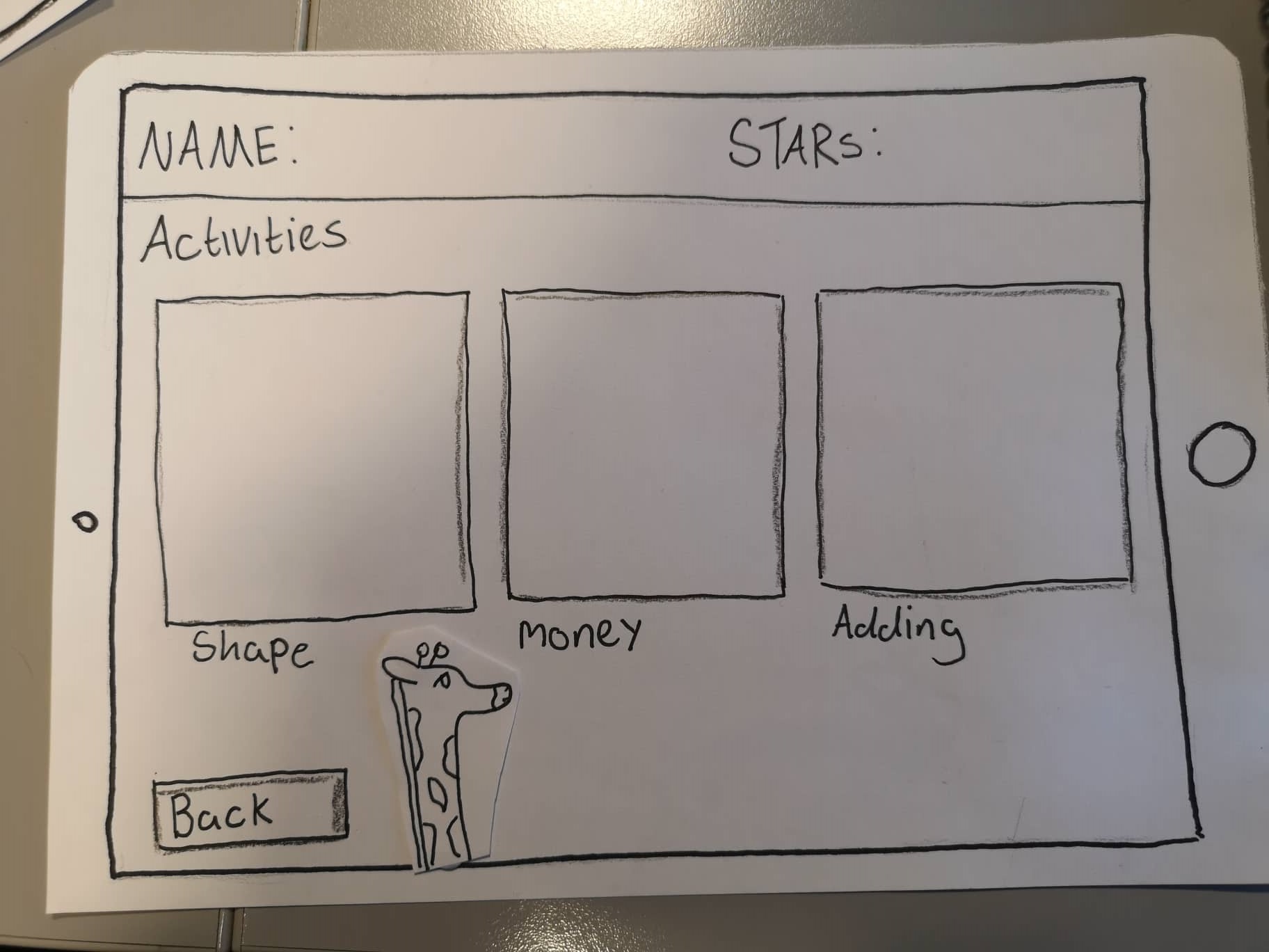
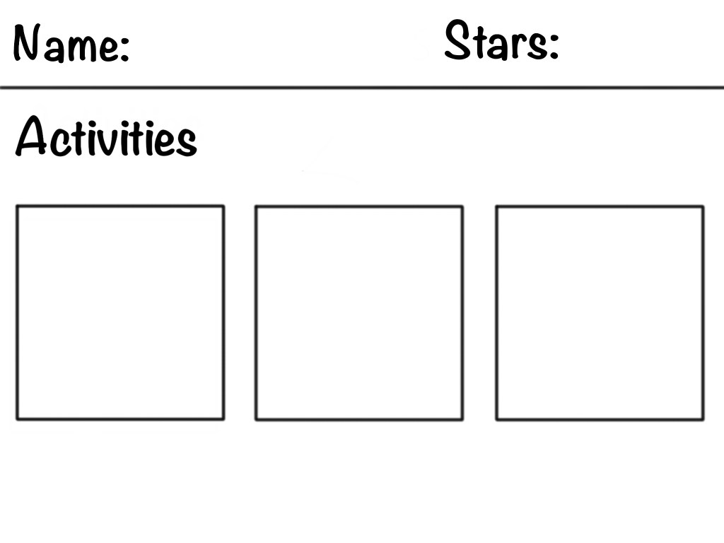
Activities menu 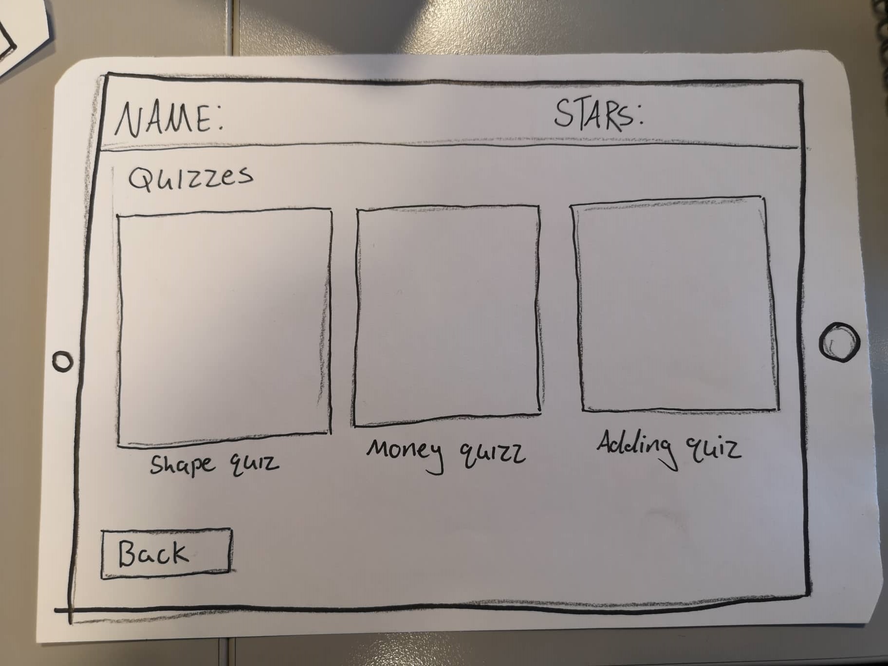
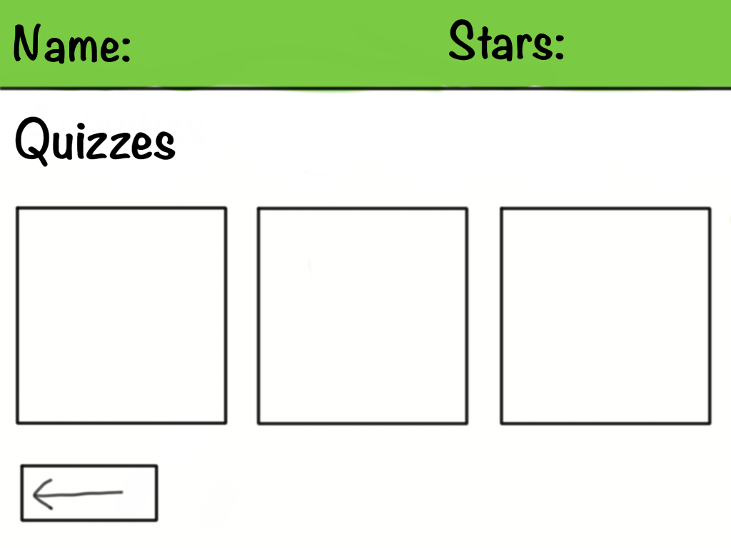
Quiz menu 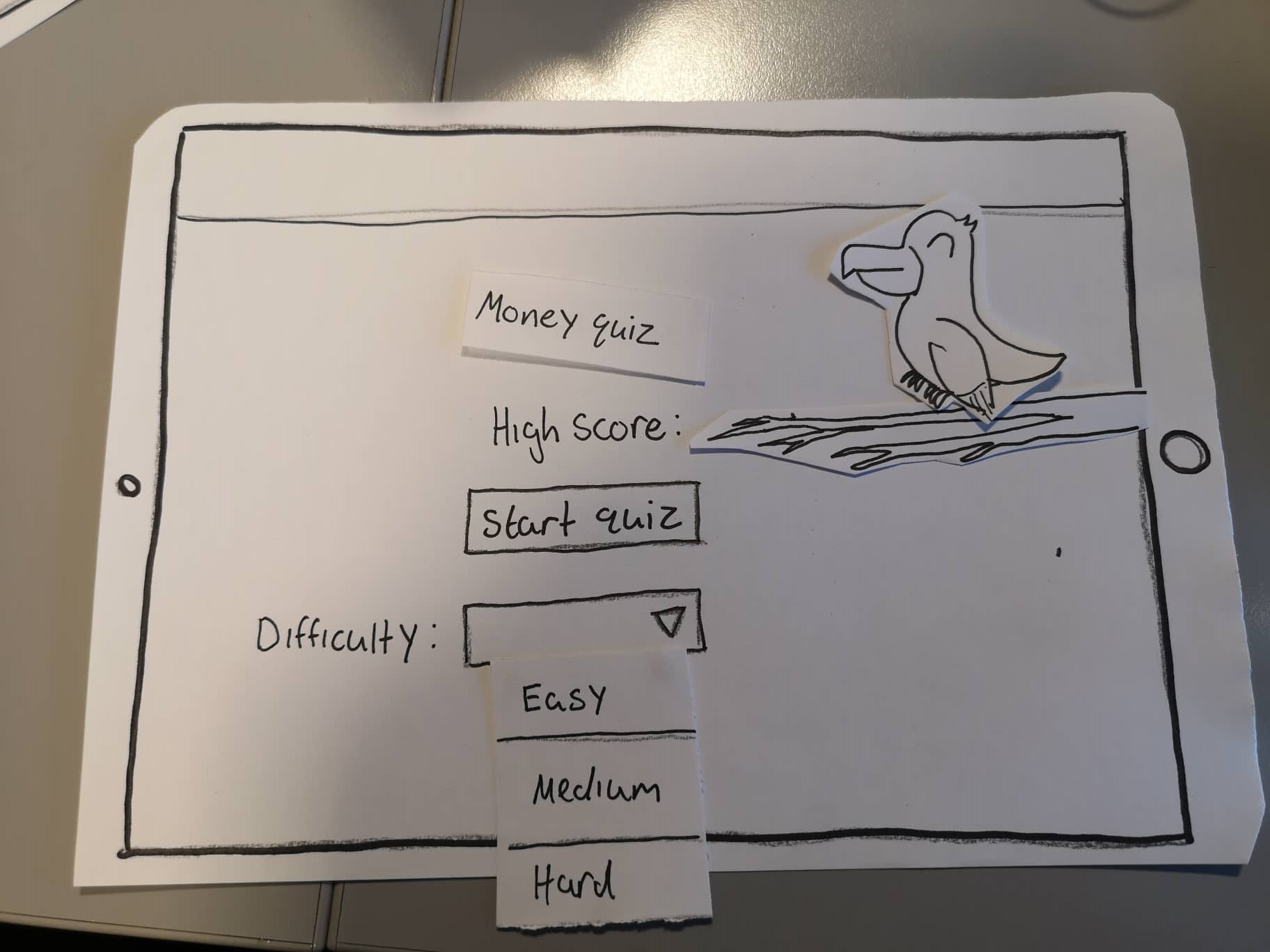
quiz 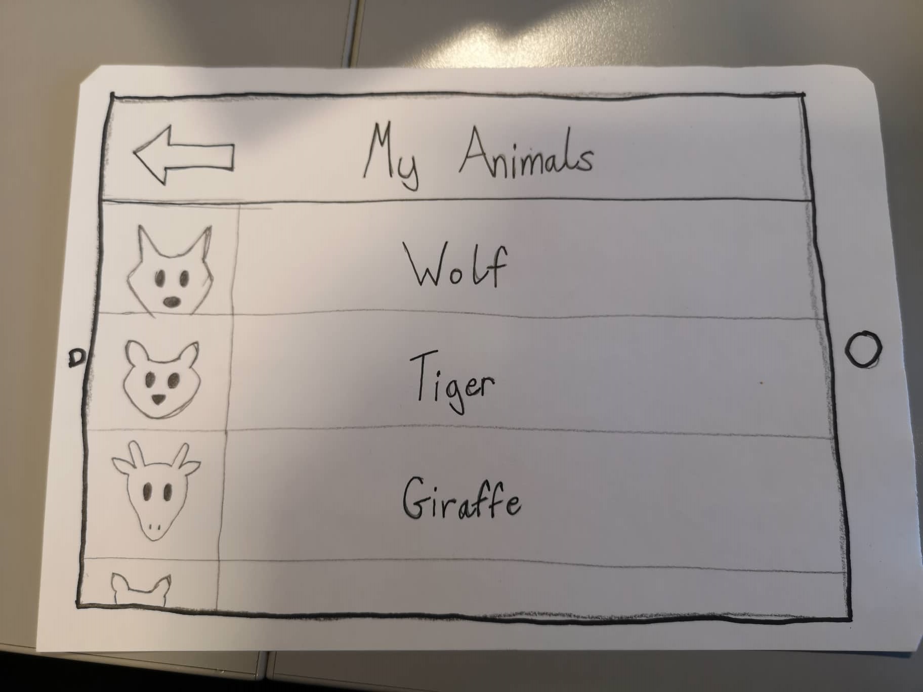
My Animal 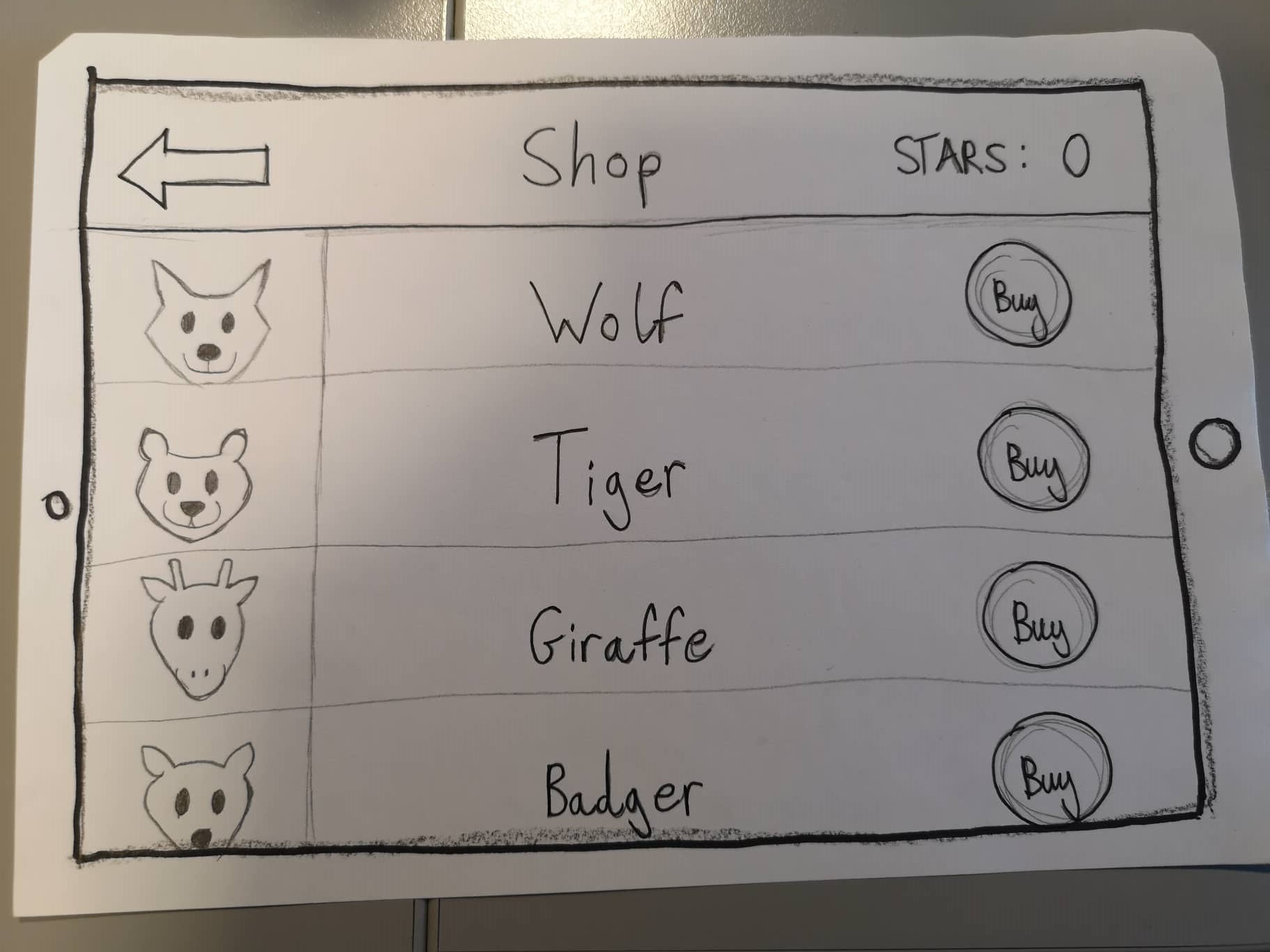
Shop 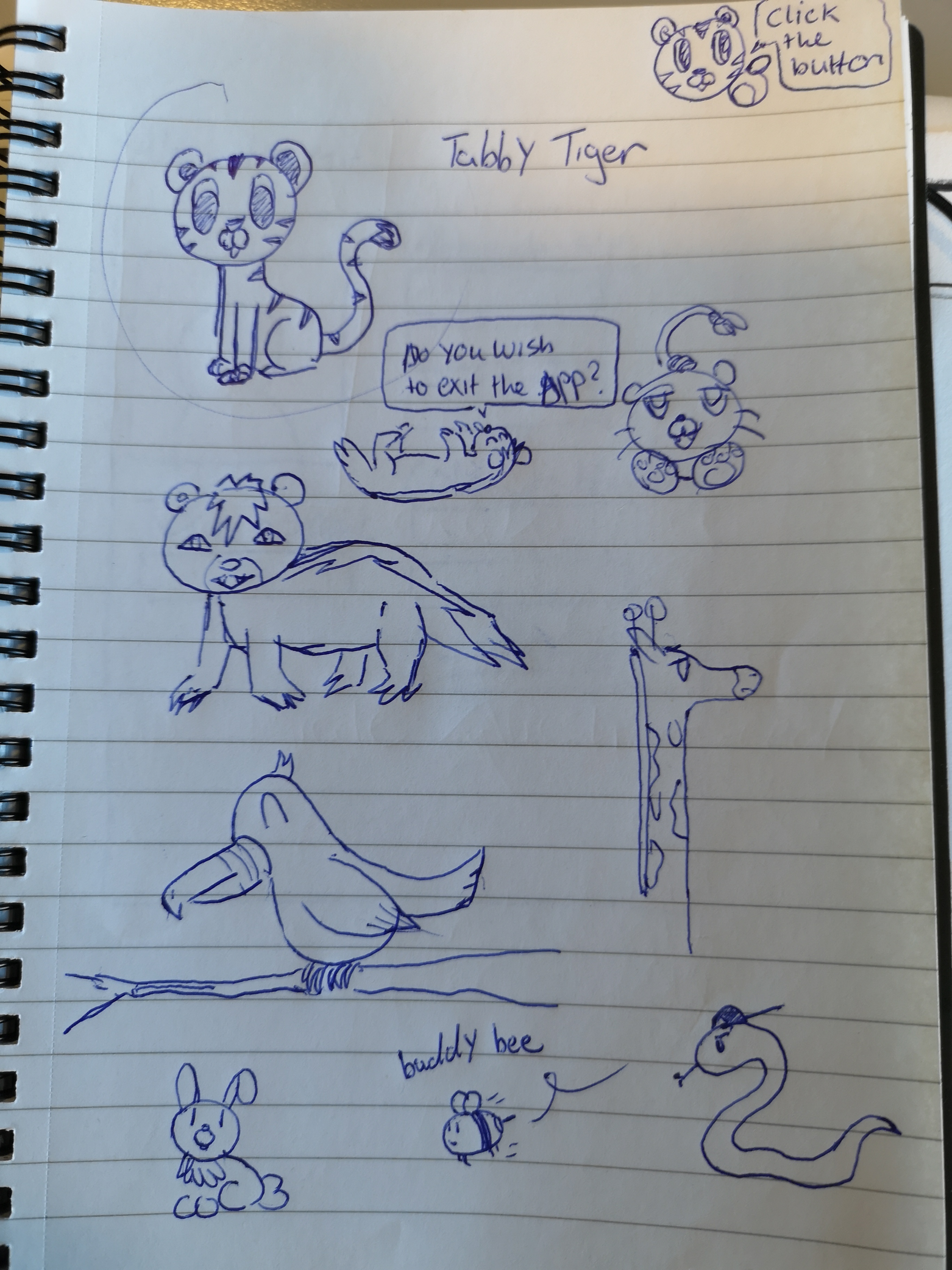
First sketch of the animals
The app is designed for tablets, so the paper prototypes are scaled to the size of one.
The prototypes were also designed on a tablet. In the tablet version color and font types were added. The colours used for this application are blue green and yellow. These colours were chosen based on the survey results. The data collected showed that blue, green and yellow were the most recurring colours. The teachers who participated in the survey found that children were the most responsive to these colours. We decided that green would be the more appealing colour for the bar at the top of the menu. Yellow was also an option but it was decided that the colour wasnt as appealing to look at as green.
The typography selected for the application were Noteworthy-Bold and Noteworthy-light. Other fonts were looked at such as comic-sans, Bubblegum-sans and Jollygood-sans. Certain aspects were taken into consideration before deciding on a font. First was readability, as it is important that the child can read what they are seeing. The second aspect that was taken into consideration was the style of the font. The font has a handwritten appeal to it. Children can often become bored and uninterested in fonts that lack character.
I made some storyboards for the activities. The activities are essentially mini games that would help children in different topics of maths.
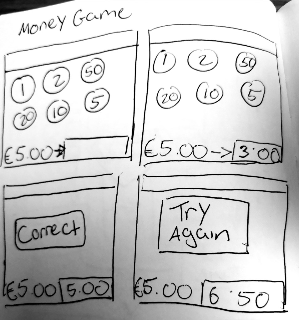
money game 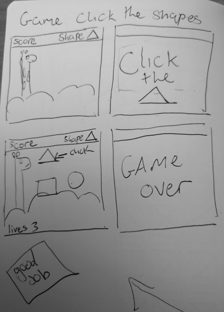
shape game 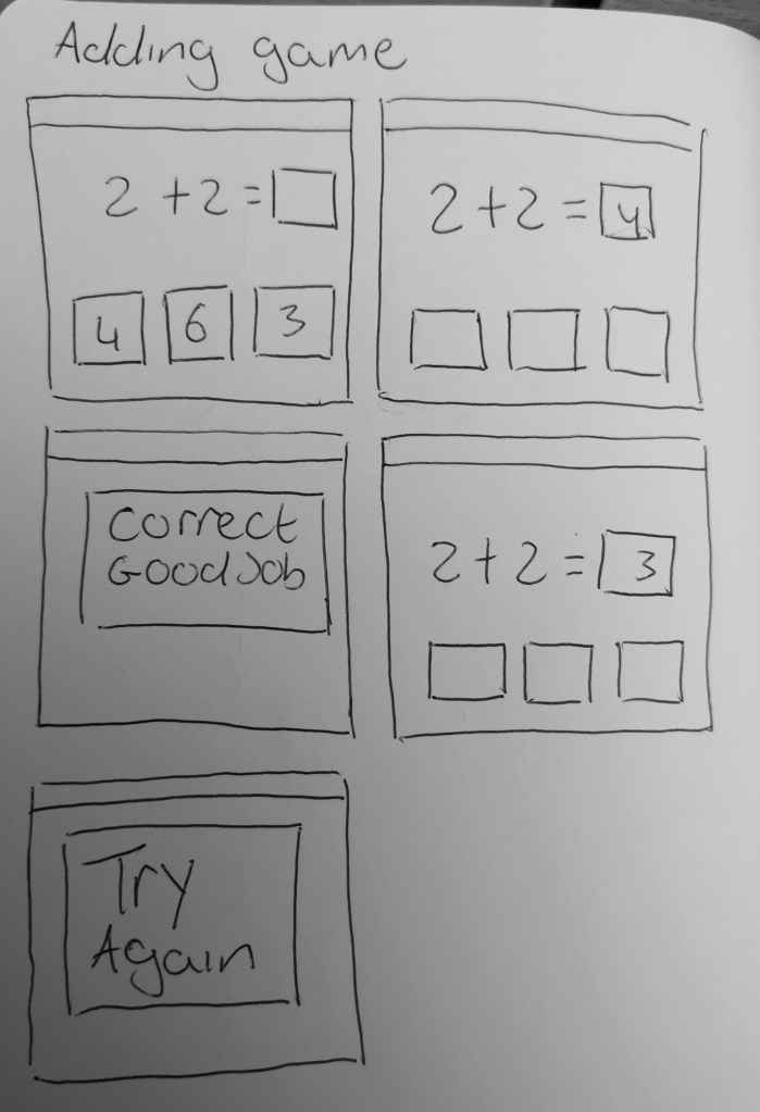
adding mini game
Throughout the design process there was not many changes made to the app. I believe the overall design is simple and clean. The layout is clear and easy to navigate. That was something we took into consideration especially since the app is aimed towards children. The content is easy to find and there is not a lot of menu screens to navigate through. The buttons are clearly labelled but there is an inconsistency with the positioning that needs to be worked out. The colour scheme is bright and appealing.
