Interviews
During the process of our project three interviews were conducted. They were Semi-structured, open-ended interviews that were conducted with three primary school teachers of varying ages and experience. These interviews lasted between 30-40 minutes. This decision was made, as this method of interviewing would be best in order to acquire the participants perceptions, opinions and advice directly and more freely. We chose these participants because they would provide vital insight into the subject and target users of the application as they themselves are in the teaching profession.
The interview participants were informed before the interview that their identities would remain anonymous within this project. The participants looked over the interview notes that were taken down during the interview and gave permission for these notes to be used in this project.
We asked all the participants the same set of questions. A sample of the questions that were asked were:
- “From your experience, what age range do you think this type of app should be aimed at?”
- “What theme do you think would appeal to children using this app the most and encourage the most engagement (e.g. Animal Themed, Monster Themed etc.)”
- “Do you think there should there be a system to create a log in account for each child? If so, what do you think the benefits of this would be? If not, what do you think the negatives would be?”
- “Should there be a reward system for the user of the app? If so, what kind of rewards system do you think would encourage the most engagement and user satisfaction?”
Reoccurring and/or contrasting answers and themes were noted during these interviews. For example, in relation to Q2 above, there was 3 common answers
- Keep it simple
- Colourful/visually appealing
- Engaging sound effects
The participants all voiced the same idea that an application like this must be simple enough for the child to use on their own, colourful/visually appealing enough to keep their attention and include enjoyable non- educational, fun little aspects such as quirky sound effects.
This data made it clear to the us that the visuals and user experience is just as important as the coding aspect of creating this app.
In relation to contrasting answers that were noted during the interview, Q4 gave a lot of varying opinions on the rewards system of the application. For example, one teacher suggested rewards system of virtual money earned that could be used in a virtual shop in the app to unlock more themes, sound effects, new character animations etc. While another teacher suggested a star reward system. These differed in that the first idea is quite intricate and creates more incentive to keep engaging with the app in order to unlock more fun features. The second suggested idea in contrast was simpler and more traditional in that the incentive is to gain more stars than other students. Both ideas encourage greater user engagement with the app but in 2 very different ways. It gave us a better insight into what kind of reward system motivates children. It made the us think about the different ways that a reward systems can motivate children in different ways. This information was vital for the application as choosing the correct incentive for children in the chosen age range is the most important part of the application experience.
personas
To help give us a better understanding of the user’s needs, a teacher persona and a child persona were created. A teacher would be a relevant user as they would assist and monitor the child while they use the application. Before the child would use the application, the teacher would test it themselves to see if it correlates with their learning plan.
The child would be the main user of the application. Narrowing down a child user can be difficult as children can vary greatly in many aspects. This includes skills, age, disabilities and social background. That is why the teacher persona is created as it would compliment the child persona and help narrow down needs.
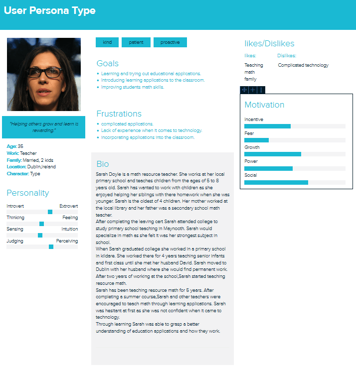
The teacher persona shows us that the application must be simple and easy use in relation to both teacher and child. The application must have activities that are relevant to the teacher’s learning outcomes for the child. The application should allow the teacher to incorporate it into the classroom environment in a natural manner. Finally, the application must be able to improve the math skills of the children using the app.
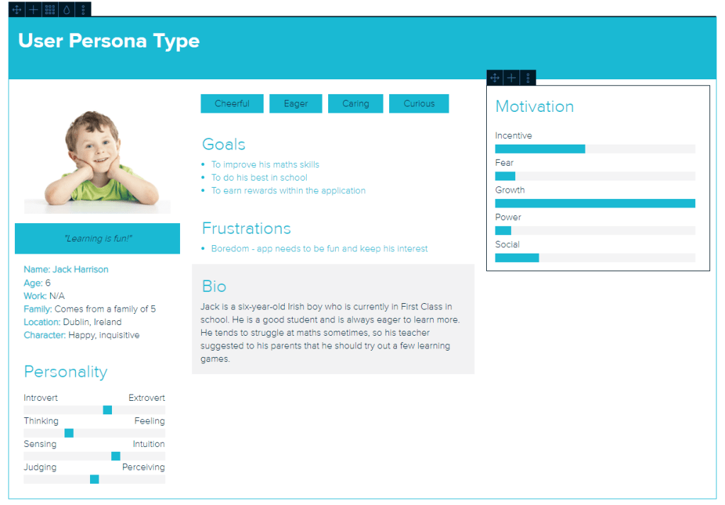
The child persona shows that the application must be engaging and challenging for children. How the application appears visually is also important as the child may become bored and lose interest. The child must be rewarded for completing tasks as it gives an incentive for the child to continue using the app.
Survey
Link to survey: https://forms.gle/oQniZUJepXs5hZTR9
Initially The survey only had 8 responses but in the last few weeks we have gained up to 8 responses. Although more we had gained more insight from different teachers the results from the survey did not change drastically. The overall aim of the survey was to further narrow down the list of requirements for the application.
From the data collected from the 20 surveys conducted, we were able to narrow down the theme for the application and the subject of the application.
The most popular subject suggested throughout the survey was Maths, which is the subject we intend to build the app around. Animals was a popular theme suggested throughout the survey answers as well as the interview answers, which in turn led us to choose an animal theme for the application.
The surveys also allowed the us to get a broader selection of reward system ideas that were not considered before, such as rewarding attempts as well as rewarding perfect answers.
The visual appeal of the application is one of the 3 key elements that were mentioned in the interviews. The survey allowed us to expand on that point, and get a range of colours that the participants of the survey found throughout their professional experience were the most appealing to children. From the data collected we were able to confirm the 4 most popular colours were Yellow, Green, Red and Blue. The most popular colours suggested were mainly primary colours, which we expected due to the fact they were talked about during the earlier interviews.
From the interviews, we got a more narrative insight as to what the participants thought of a log in account system for the application. In the survey we created a close ended question in relation to a log in account system. It was a simple yes or no answer option for this question in the survey. 13 out of the 20 survey participants said yes to the login account system idea. This is a 65% yes vote in favour of the system, which was invaluable information for the research. This was done in order to gain more quantitative data that could be measured, whereas the interviews provided more details on what the participants actually thought of the idea and what they thought were the benefits/negatives of the idea. This gave us a great mixture of qualitative and quantitative data for our research.
scenarios/task modelling
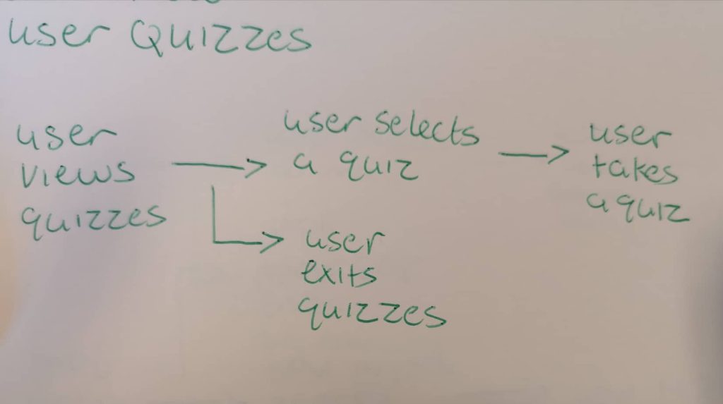
This is an example of a task a child would undertake while using the app.
Jack, age 6, is asked by his teacher Ms. Doyle (age 35) to complete a quiz within the app. The app is on a tablet provided by the teacher. Jack must navigate from the menu to the quiz section.
Goal:
Jacks goal is to complete the quiz
Sub-goals:
- Jack opens the app.
- He selects his name and is brought to the main menu.
- He clicks the quiz button and is brought to the quiz menu.
- He selects the quiz that the teacher has asked him to do.
After creating this scenario I asked a fellow student to do the exact same task that was done in the scenario. Using the paper prototypes I asked the student to take a quiz. The student was able to to navigate themselves from the main menu to the quiz menu. They then picked a quiz they would like to do. After that they picked a difficulty and began the quiz. After the task was completed I asked the student the following questions:
- Was it difficult to navigate through the different screens and menus of the app?
- Is there anything you would change?
The students response to the first question was overall positive. They said they didn’t find it difficult maneuvering through the different screens. This answer lead me to believe that the design for the different screens is simple and easy to use and that not much has to change with the design.
The students answer for the second question talked about the buttons. The student mentioned that the buttons could have more consistency and a different placement. I noted this response down and considered ways of changing this problem. I discussed this with my project partner and we agreed to change the buttons so that they would have more consistency and placement throughout the app.
