I would say overall the project went well. I believe the project turned out as well as it could have for the limited amount of time we had. I like the design and overall look of the app.
Did the team work well together?
Working in a group for such a big project is definitely a new experience for me. Through out my 3 years of college I have rarely had to work in a group. I found myself overwhelmed at times, as when you are working with another person compromises have to be made to move forward with the project.
I took on a more leader type role in the project which was also a new experience for me. I would designate and assign tasks that would need to be done. I would try and motivate my project partner when work progress would start to slow down.
I believe me and my project partner work well together but there can be moments of frustration.
What problems did you encounter?
I think one of the problems we encountered with this project was time management. I think me and my project partner would get too caught up in certain parts of the project and neglect other aspects that should’ve been focused on.
What did you contribute to the project?
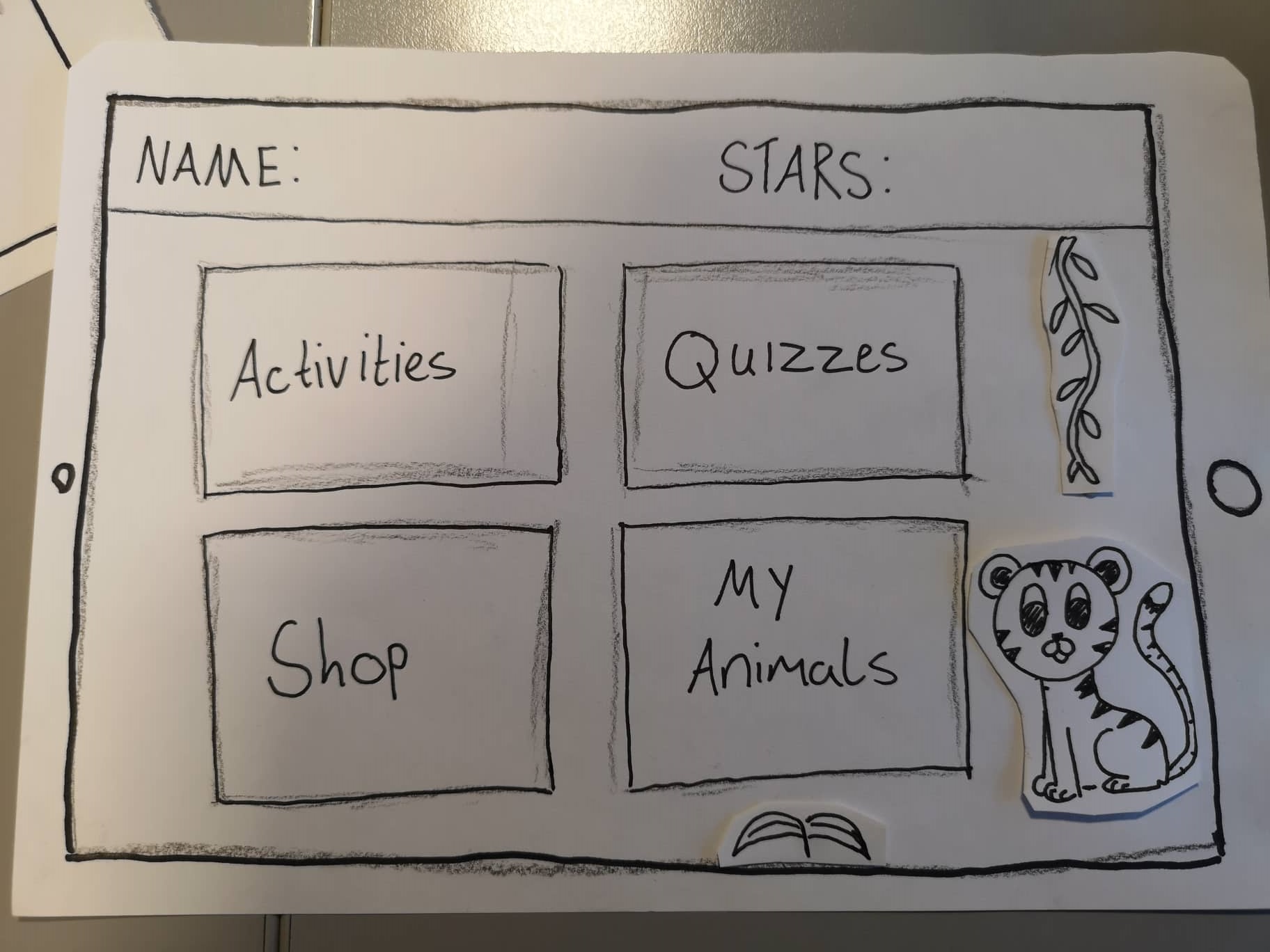
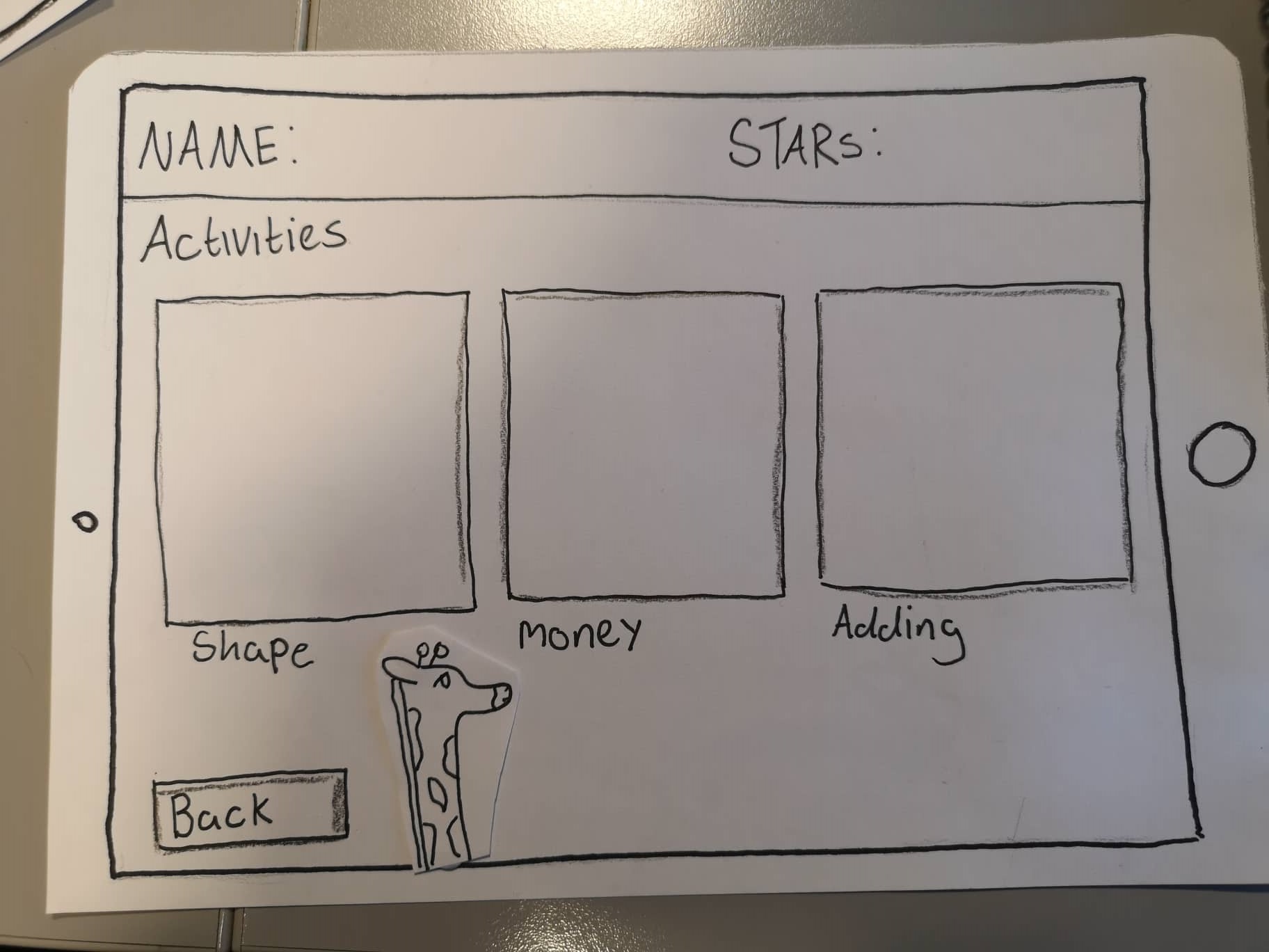
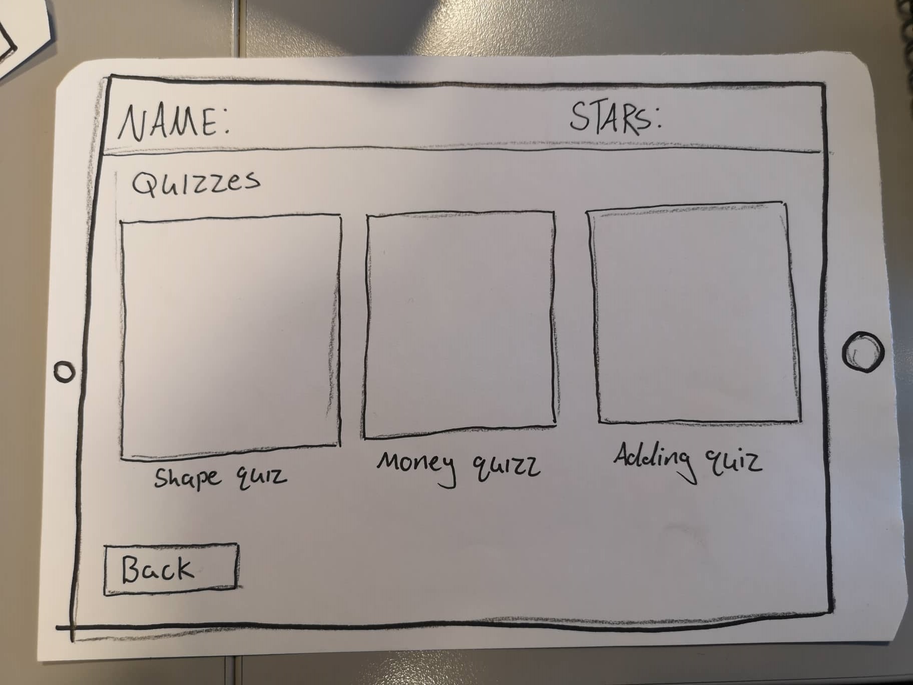
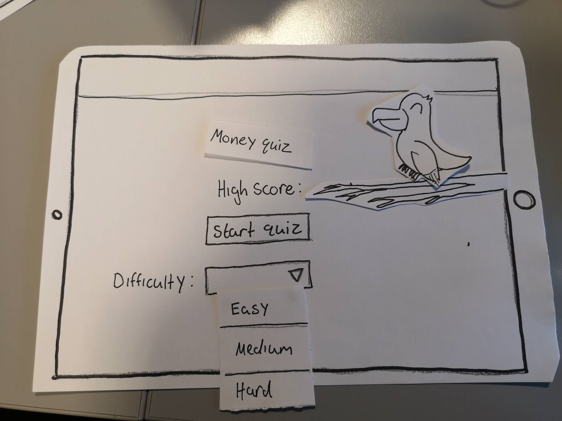
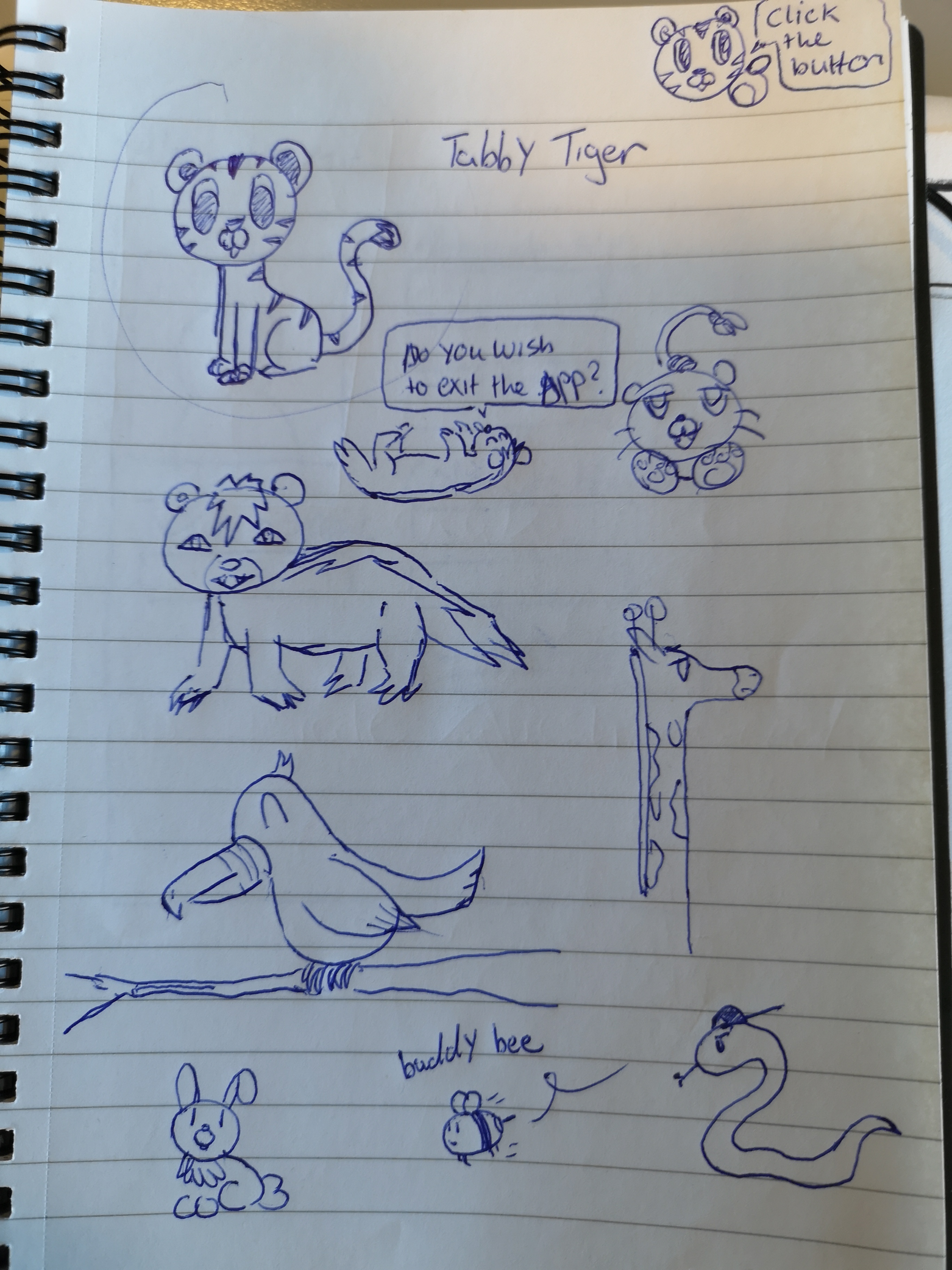
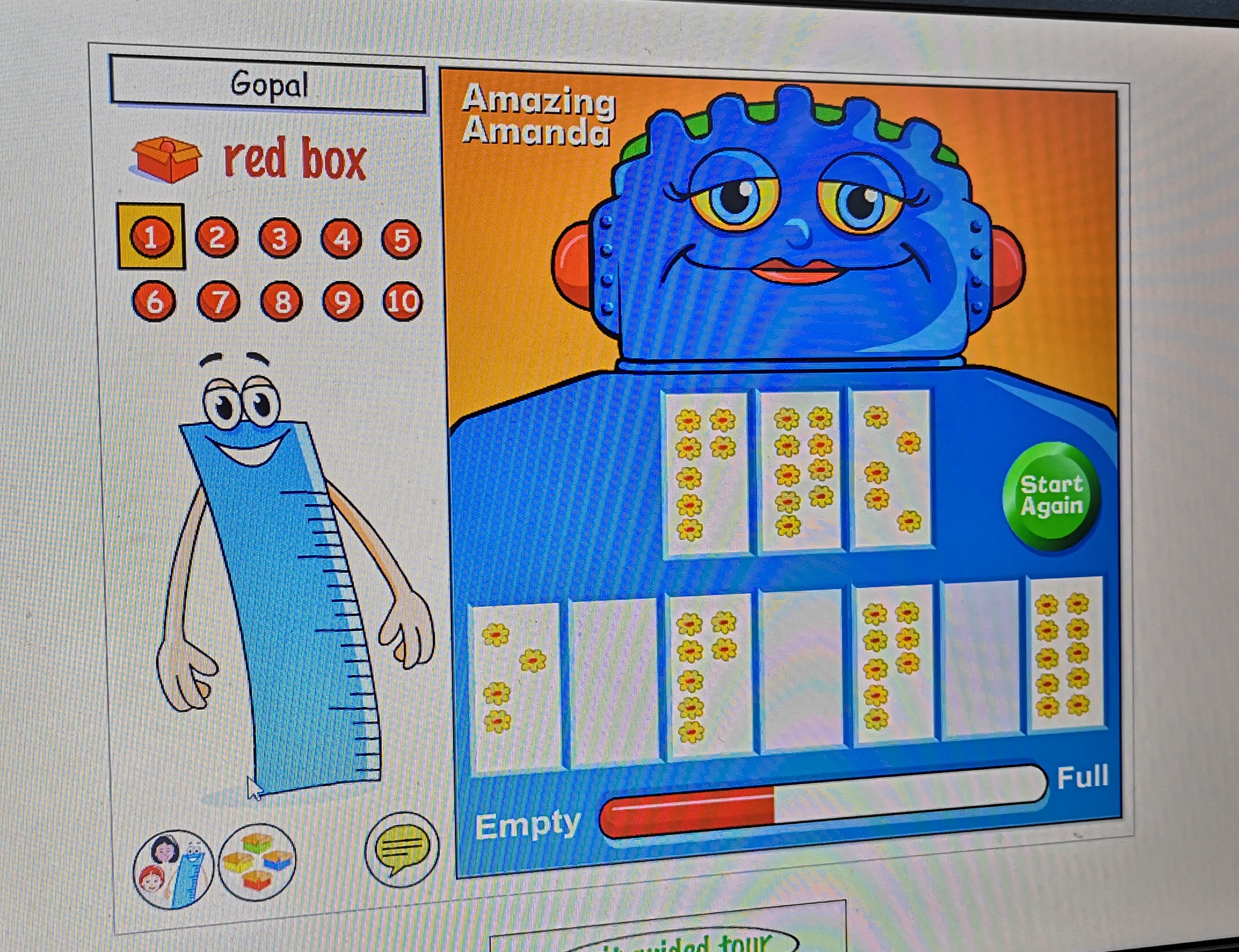
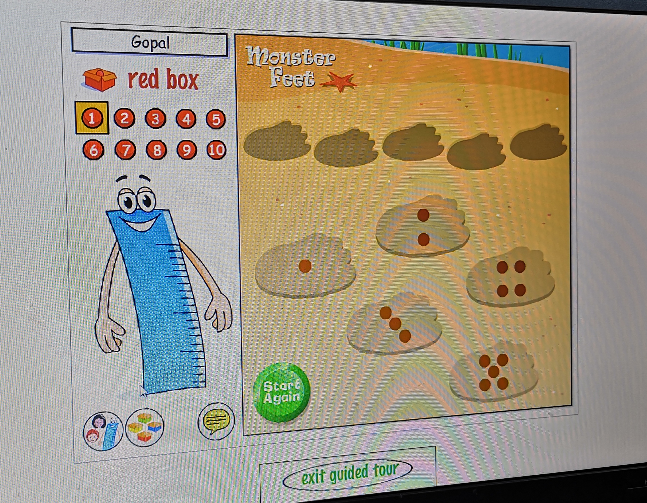
I think I contributed quite a bit of research to the project. I interviewed most of the teachers and found useful resources that helped with the research process. Tara and I made the survey/questions. I found teachers to participate in the survey by asking the teachers interviewed to send the survey on to other teachers. I created a teacher persona and scenario/task. I designed the main menu, activities menu, quiz menu and quiz. Finally I designed some of the animals that go with the apps animal theme.
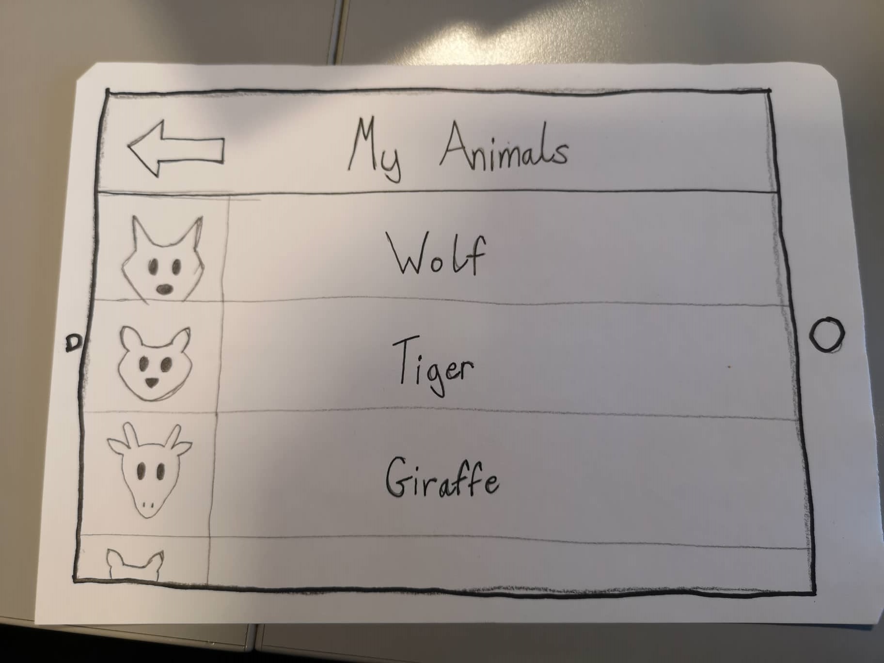
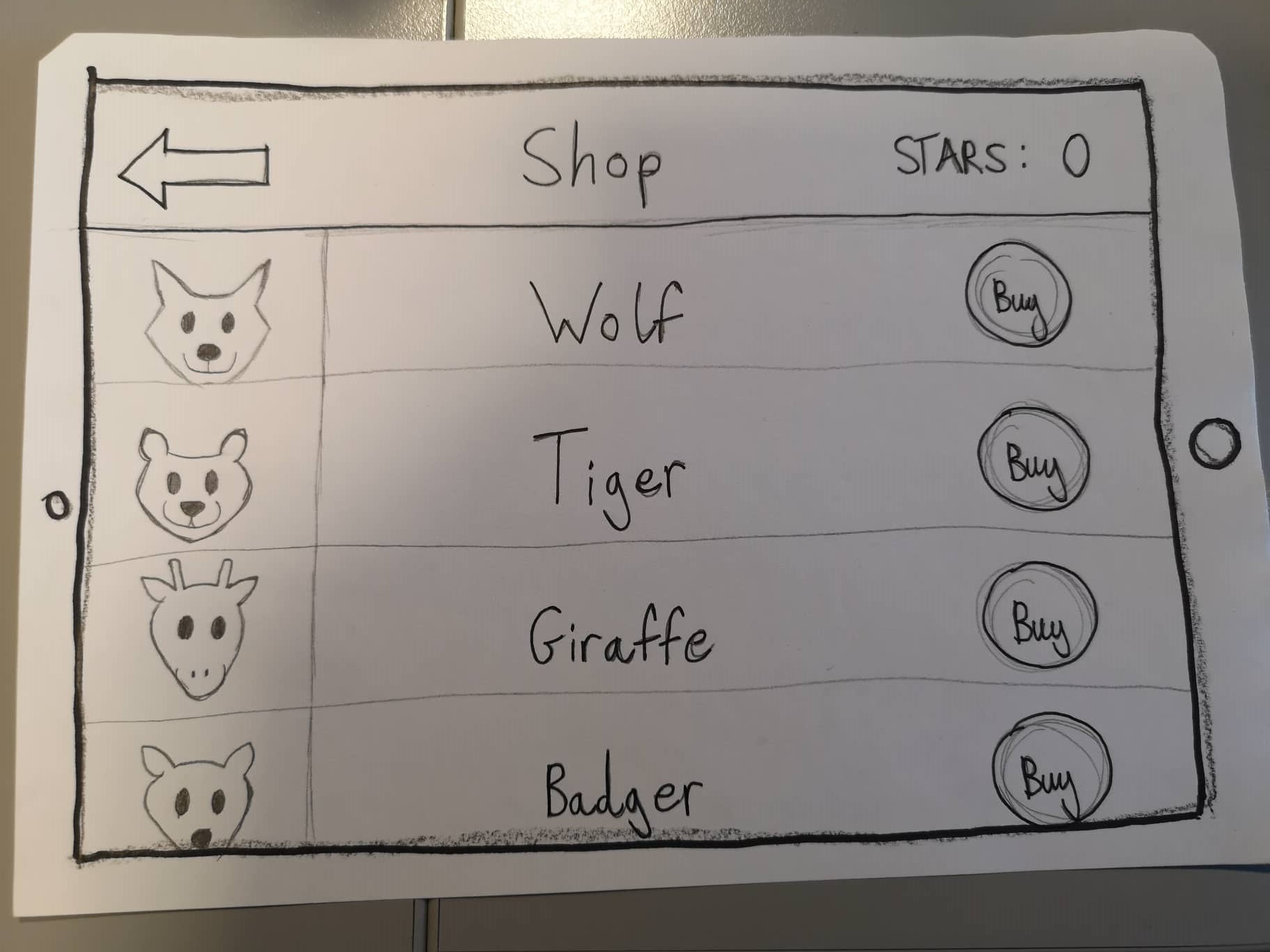
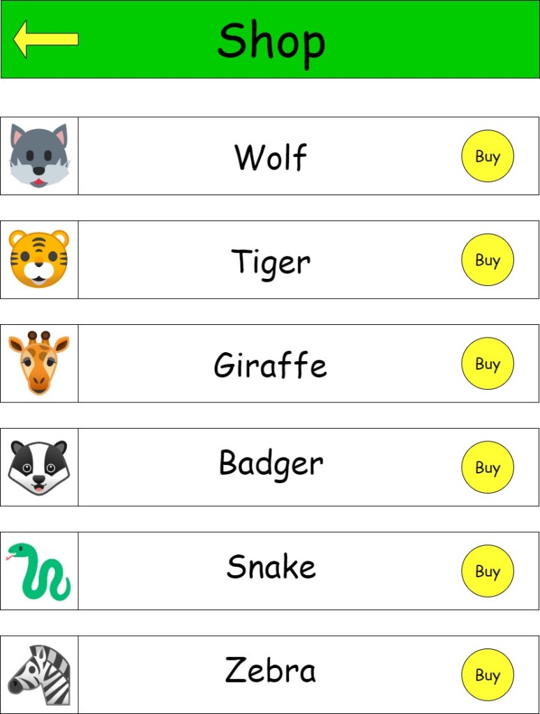
When it came to designing the paper prototypes Tara and I took on different sections to design. I designed the main menu,activities menu,quiz menu and quiz screen. While Tara designed the shop and my animals screens. I also designed some animals to go with the animal theme of the app.
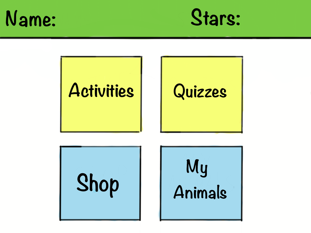
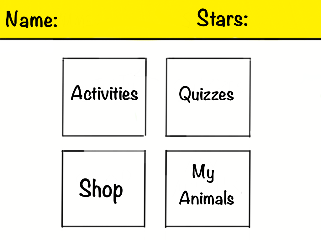
Main menu
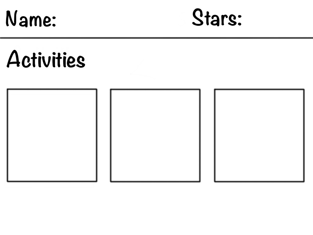
Activities menu
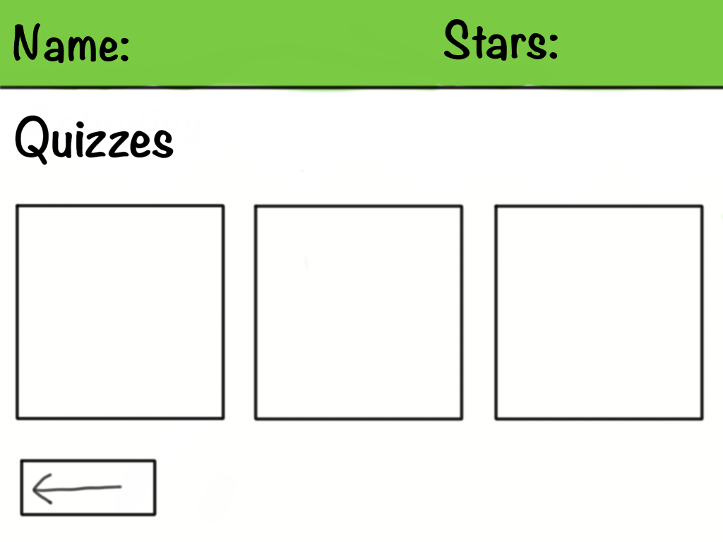
Quiz menu
quiz
My Animal
Shop
First sketch of the animals
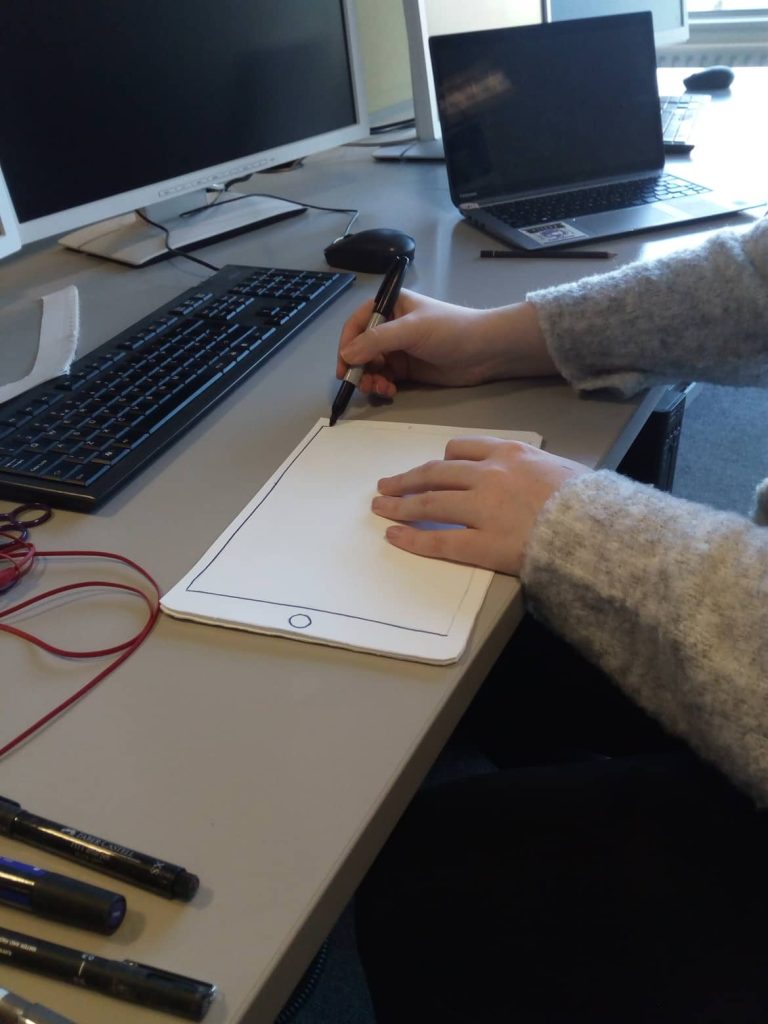
The app is designed for tablets, so the paper prototypes are scaled to the size of one.
The prototypes were also designed on a tablet. In the tablet version color and font types were added. The colours used for this application are blue green and yellow. These colours were chosen based on the survey results. The data collected showed that blue, green and yellow were the most recurring colours. The teachers who participated in the survey found that children were the most responsive to these colours. We decided that green would be the more appealing colour for the bar at the top of the menu. Yellow was also an option but it was decided that the colour wasnt as appealing to look at as green.
The typography selected for the application were Noteworthy-Bold and Noteworthy-light. Other fonts were looked at such as comic-sans, Bubblegum-sans and Jollygood-sans. Certain aspects were taken into consideration before deciding on a font. First was readability, as it is important that the child can read what they are seeing. The second aspect that was taken into consideration was the style of the font. The font has a handwritten appeal to it. Children can often become bored and uninterested in fonts that lack character.
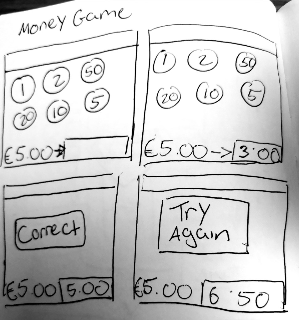
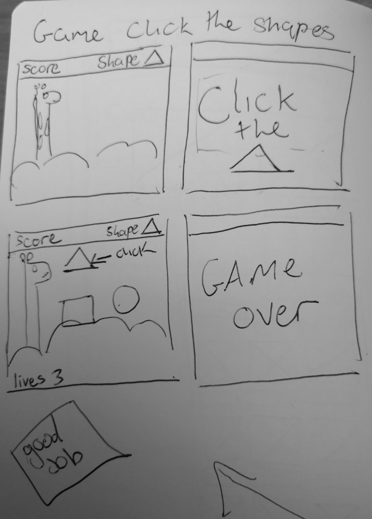
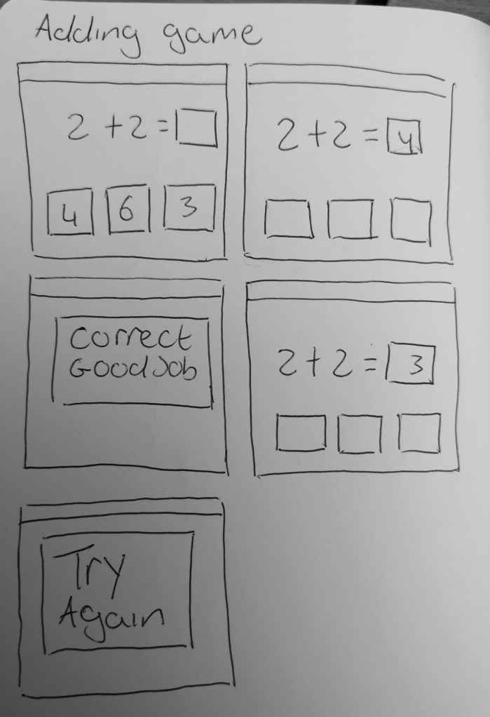
I made some storyboards for the activities. The activities are essentially mini games that would help children in different topics of maths.
money game
shape game
adding mini game
Throughout the design process there was not many changes made to the app. I believe the overall design is simple and clean. The layout is clear and easy to navigate. That was something we took into consideration especially since the app is aimed towards children. The content is easy to find and there is not a lot of menu screens to navigate through. The buttons are clearly labelled but there is an inconsistency with the positioning that needs to be worked out. The colour scheme is bright and appealing.
During the process of our project three interviews were conducted. They were Semi-structured, open-ended interviews that were conducted with three primary school teachers of varying ages and experience. These interviews lasted between 30-40 minutes. This decision was made, as this method of interviewing would be best in order to acquire the participants perceptions, opinions and advice directly and more freely. We chose these participants because they would provide vital insight into the subject and target users of the application as they themselves are in the teaching profession.
The interview participants were informed before the interview that their identities would remain anonymous within this project. The participants looked over the interview notes that were taken down during the interview and gave permission for these notes to be used in this project.
We asked all the participants the same set of questions. A sample of the questions that were asked were:
“From your experience, what age range do you think this type of app should be aimed at?”
“What theme do you think would appeal to children using this app the most and encourage the most engagement (e.g. Animal Themed, Monster Themed etc.)”
“Do you think there should there be a system to create a log in account for each child? If so, what do you think the benefits of this would be? If not, what do you think the negatives would be?”
“Should there be a reward system for the user of the app? If so, what kind of rewards system do you think would encourage the most engagement and user satisfaction?”
Reoccurring and/or contrasting answers and themes were noted during these interviews. For example, in relation to Q2 above, there was 3 common answers
Keep it simple
Colourful/visually appealing
Engaging sound effects
The participants all voiced the same idea that an application like this must be simple enough for the child to use on their own, colourful/visually appealing enough to keep their attention and include enjoyable non- educational, fun little aspects such as quirky sound effects.
This data made it clear to the us that the visuals and user experience is just as important as the coding aspect of creating this app.
In relation to contrasting answers that were noted during the interview, Q4 gave a lot of varying opinions on the rewards system of the application. For example, one teacher suggested rewards system of virtual money earned that could be used in a virtual shop in the app to unlock more themes, sound effects, new character animations etc. While another teacher suggested a star reward system. These differed in that the first idea is quite intricate and creates more incentive to keep engaging with the app in order to unlock more fun features. The second suggested idea in contrast was simpler and more traditional in that the incentive is to gain more stars than other students. Both ideas encourage greater user engagement with the app but in 2 very different ways. It gave us a better insight into what kind of reward system motivates children. It made the us think about the different ways that a reward systems can motivate children in different ways. This information was vital for the application as choosing the correct incentive for children in the chosen age range is the most important part of the application experience.
personas
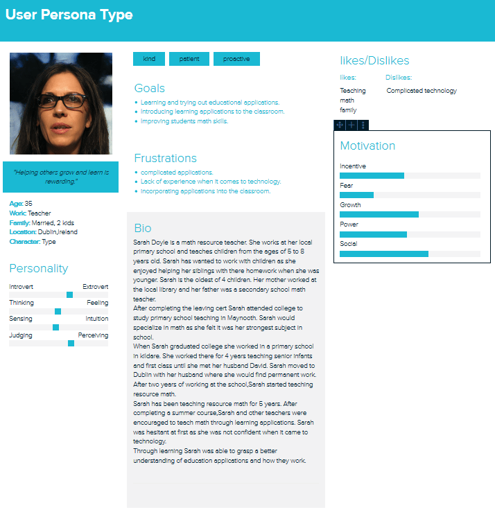
To help give us a better understanding of the user’s needs, a teacher persona and a child persona were created. A teacher would be a relevant user as they would assist and monitor the child while they use the application. Before the child would use the application, the teacher would test it themselves to see if it correlates with their learning plan.
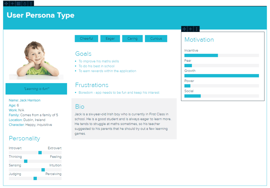
The child would be the main user of the application. Narrowing down a child user can be difficult as children can vary greatly in many aspects. This includes skills, age, disabilities and social background. That is why the teacher persona is created as it would compliment the child persona and help narrow down needs.
The teacher persona shows us that the application must be simple and easy use in relation to both teacher and child. The application must have activities that are relevant to the teacher’s learning outcomes for the child. The application should allow the teacher to incorporate it into the classroom environment in a natural manner. Finally, the application must be able to improve the math skills of the children using the app.
The child persona shows that the application must be engaging and challenging for children. How the application appears visually is also important as the child may become bored and lose interest. The child must be rewarded for completing tasks as it gives an incentive for the child to continue using the app.
Initially The survey only had 8 responses but in the last few weeks we have gained up to 8 responses. Although more we had gained more insight from different teachers the results from the survey did not change drastically. The overall aim of the survey was to further narrow down the list of requirements for the application.
From the data collected from the 20 surveys conducted, we were able to narrow down the theme for the application and the subject of the application.
The most popular subject suggested throughout the survey was Maths, which is the subject we intend to build the app around. Animals was a popular theme suggested throughout the survey answers as well as the interview answers, which in turn led us to choose an animal theme for the application.
The surveys also allowed the us to get a broader selection of reward system ideas that were not considered before, such as rewarding attempts as well as rewarding perfect answers.
The visual appeal of the application is one of the 3 key elements that were mentioned in the interviews. The survey allowed us to expand on that point, and get a range of colours that the participants of the survey found throughout their professional experience were the most appealing to children. From the data collected we were able to confirm the 4 most popular colours were Yellow, Green, Red and Blue. The most popular colours suggested were mainly primary colours, which we expected due to the fact they were talked about during the earlier interviews.
From the interviews, we got a more narrative insight as to what the participants thought of a log in account system for the application. In the survey we created a close ended question in relation to a log in account system. It was a simple yes or no answer option for this question in the survey. 13 out of the 20 survey participants said yes to the login account system idea. This is a 65% yes vote in favour of the system, which was invaluable information for the research. This was done in order to gain more quantitative data that could be measured, whereas the interviews provided more details on what the participants actually thought of the idea and what they thought were the benefits/negatives of the idea. This gave us a great mixture of qualitative and quantitative data for our research.
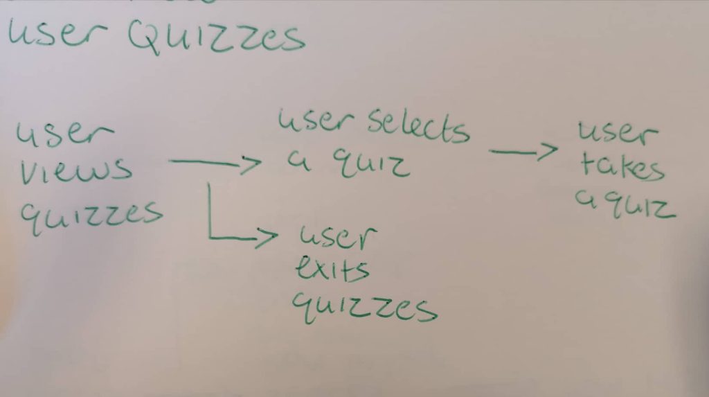
scenarios/task modelling
This is an example of a task a child would undertake while using the app.
Jack, age 6, is asked by his teacher Ms. Doyle (age 35) to complete a quiz within the app. The app is on a tablet provided by the teacher. Jack must navigate from the menu to the quiz section.
Goal:
Jacks goal is to complete the quiz
Sub-goals:
Jack opens the app.
He selects his name and is brought to the main menu.
He clicks the quiz button and is brought to the quiz menu.
He selects the quiz that the teacher has asked him to do.
Task diagram for doing a quiz
After creating this scenario I asked a fellow student to do the exact same task that was done in the scenario. Using the paper prototypes I asked the student to take a quiz. The student was able to to navigate themselves from the main menu to the quiz menu. They then picked a quiz they would like to do. After that they picked a difficulty and began the quiz. After the task was completed I asked the student the following questions:
Was it difficult to navigate through the different screens and menus of the app?
Is there anything you would change?
The students response to the first question was overall positive. They said they didn’t find it difficult maneuvering through the different screens. This answer lead me to believe that the design for the different screens is simple and easy to use and that not much has to change with the design.
The students answer for the second question talked about the buttons. The student mentioned that the buttons could have more consistency and a different placement. I noted this response down and considered ways of changing this problem. I discussed this with my project partner and we agreed to change the buttons so that they would have more consistency and placement throughout the app.
Math fun is an android application that will be used in a school-based environment. The application is aimed at children between the ages of 5 and 8. This project is a joint collaboration between me and my project partner Tara.
The Problem
The main problem our application aims to fix is how many apps are individual with content. Many math applications are self contained and only focus on one topic e.g money. From interviewing teachers who use applications to teach children, we found that they would spend long hours searching through the app store to try and find applications that suited there learning plan. One of the teachers interviewed(see user research) showed a spreadsheet of all the different applications she uses. The teacher also said she has to keep track of the children’s progress within each individual app. Our goal is to get rid of the time consuming search for math applications and have all the content contained into one big app.
Similar applications
While researching for the project we looked at several children’s educational applications. Some were recommended by the teachers interviewed. we looked at and assessed the apps on aspects that would be applicable to the application being made. Out of all the applications that were examined, three were selected as they contained relevant features such as reward systems, teacher-student interaction and math-based games. Another aspect that was taken into consideration was the visual appeal and color scheme.
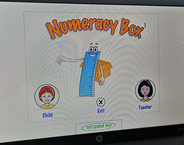
Numeracy box
Numeracy box is designed to provide an extensive bank of teacher-controlled activities and games. These focus on the statements and examples relating to number and the number system in the national numeracy strategy.
Numeracy box has a teacher-student interaction, which are application takes inspiration from. The programme allows the teacher to customize the child’s personal experience and learning outcomes. The application lets the teacher change the level difficulty depending on the child’s ability and age.
Visually the programme is not as appealing as more modern children’s apps. Numeracy box is an older programme from the early 2000s. Its design can be considered outdated with its lack of colour and interesting theme.
Khan academy kids
Khan academy kids is an application that contains games, books, songs and activities. I found Khan academy to one of the more aesthetically applealing apps out of the ones we looked at. The app does contain multiple math topics but in my opinion it is not suited for a school based environment.
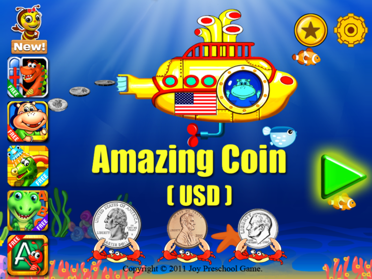
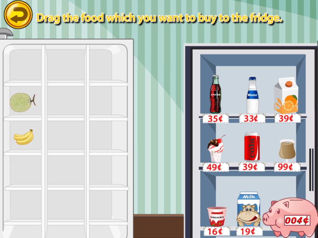
Amazing coin
Amazing Coin is an educational game for children to practice identifying and solving maths problems with coins. It teaches children how to recognize, count, add, pay and make change with coins. This application rewards the children with money which in turn allows them to buy food in the store and eat them later.
The coin games are engaging and interesting to play. The variety of games are fun and teaches children valuable math-based skills. The reward system is satisfying as it allows children to earn currency from the different games and use them in the virtual shop.
The reward system does not match the overarching theme. They look like two different applications were put together. The main game has an underwater theme while the reward system is a grocery store themed activity in the app.
The three apps have qualities that inspired the app we are trying to make. Taking the positive qualities of the apps such as color,interactivity, and rewards for effort helped us build our app. It also helped us look at the negative qualities and how we can build upon them.
This is an example post, originally published as part of Blogging University. Enroll in one of our ten programs, and start your blog right.
You’re going to publish a post today. Don’t worry about how your blog looks. Don’t worry if you haven’t given it a name yet, or you’re feeling overwhelmed. Just click the “New Post” button, and tell us why you’re here.
Why do this?
Because it gives new readers context. What are you about? Why should they read your blog?
Because it will help you focus you own ideas about your blog and what you’d like to do with it.
The post can be short or long, a personal intro to your life or a bloggy mission statement, a manifesto for the future or a simple outline of your the types of things you hope to publish.
To help you get started, here are a few questions:
Why are you blogging publicly, rather than keeping a personal journal?
What topics do you think you’ll write about?
Who would you love to connect with via your blog?
If you blog successfully throughout the next year, what would you hope to have accomplished?
You’re not locked into any of this; one of the wonderful things about blogs is how they constantly evolve as we learn, grow, and interact with one another — but it’s good to know where and why you started, and articulating your goals may just give you a few other post ideas.
Can’t think how to get started? Just write the first thing that pops into your head. Anne Lamott, author of a book on writing we love, says that you need to give yourself permission to write a “crappy first draft”. Anne makes a great point — just start writing, and worry about editing it later.
When you’re ready to publish, give your post three to five tags that describe your blog’s focus — writing, photography, fiction, parenting, food, cars, movies, sports, whatever. These tags will help others who care about your topics find you in the Reader. Make sure one of the tags is “zerotohero,” so other new bloggers can find you, too.